Recognition in seconds
People decide fast. Consistent type, colour roles, and logo use make the brand readable before they finish the first line of copy.
Logo, typography, colour, and layout rules pulled into one practical system so marketing, product, and the next site stay aligned instead of drifting into competing versions of the brand.


.png)
Touchpoints we design for
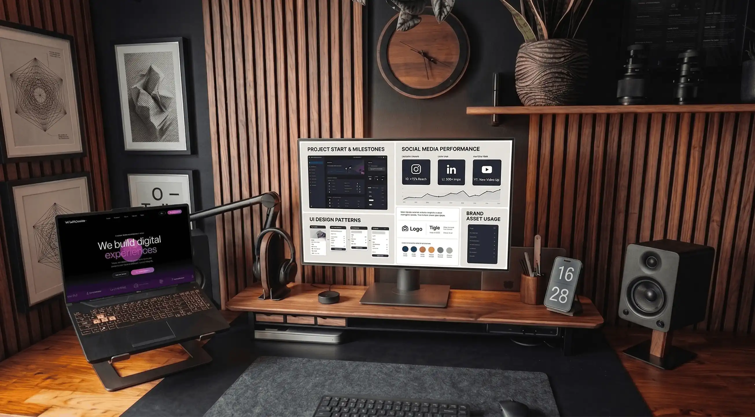
Identity has to work in social crops, dark UIs, checkout, and tight mobile navigation. We deliver logo, type, colour, and layout rules your next web design round and everyday marketing can share without improvisation.
People decide fast. Consistent type, colour roles, and logo use make the brand readable before they finish the first line of copy.
Loose application looks careless everywhere. Clear rules for spacing, sub-brands, and photography keep one coherent story.
Tokens and a usable system early on save painful fixes when site, ads, and packaging start to drift apart.
“Visitors should recognise your brand immediately. Character comes from type, motion, and art direction, not from hiding price or the primary action.”
Brand identity should be something organisations live every week, not a file nobody opens. Logo, type, colour, and rules are structured so marketing, product, and the next rebuild stay consistent on Shopify, Framer, WordPress, or a custom stack.
A brand is more than a logo on a slide deck. It is how people meet your brand in checkout, email, and social. We shape systems that stay clear in those places, then connect cleanly to UX/UI and build.
Workshops and analysis on positioning, proof points, and category context so the story your organisation tells online is concrete enough to guide layout, copy, and campaigns.
Visual hierarchy, contrast, and safe variants for small screens, dark backgrounds, and busy templates, not only hero treatments.
Concise, example-led rules on photography, spacing, motion, and tone that marketing and product can apply on their own ship dates.
Colour roles, type scales, and component naming aligned with how the product is actually built so brand and code stay friends.
Social, ads, and partner decks share the same grid logic as core web templates so the experience does not fall apart off the homepage.
Logo directions and lockups, typographic hierarchy, colour choices tested for contrast, layout rules, and a concise guideline your team can rely on. Scope scales with channels and whether a site relaunch runs in parallel.
A mark without rules tends to fail the moment it hits social crops, dark interfaces, or a full checkout. With a smaller budget we still define a minimal system so applications stay consistent.
Yes. We review what still works, what adds noise, and what must change before the next site or campaign cycle.
The live site is where people see your brand most days. We align type scale, spacing rhythm, and component tone with what ships next, whether that is Shopify, Framer, WordPress, or custom.
Tell us what is launching, who is involved, the timing, and what must stay recognisable. We send back a clear scope.
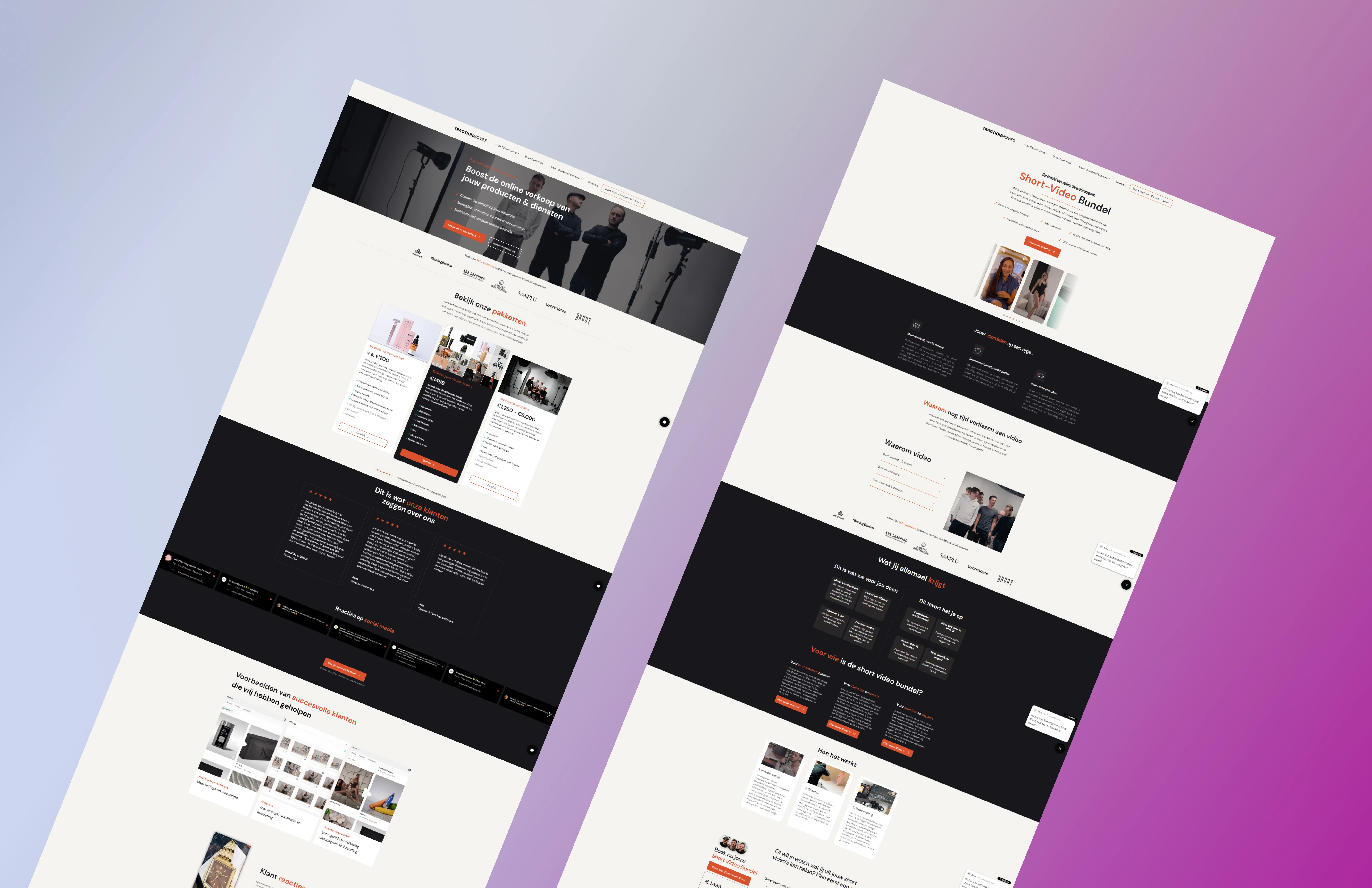
WordPress to Framer migration with a rebrand-led design built for lead generation, booked calls, and portfolio credibility.
Framer portfolio for a branding studio: bold visuals, quick load times, and room for the team to grow the site.
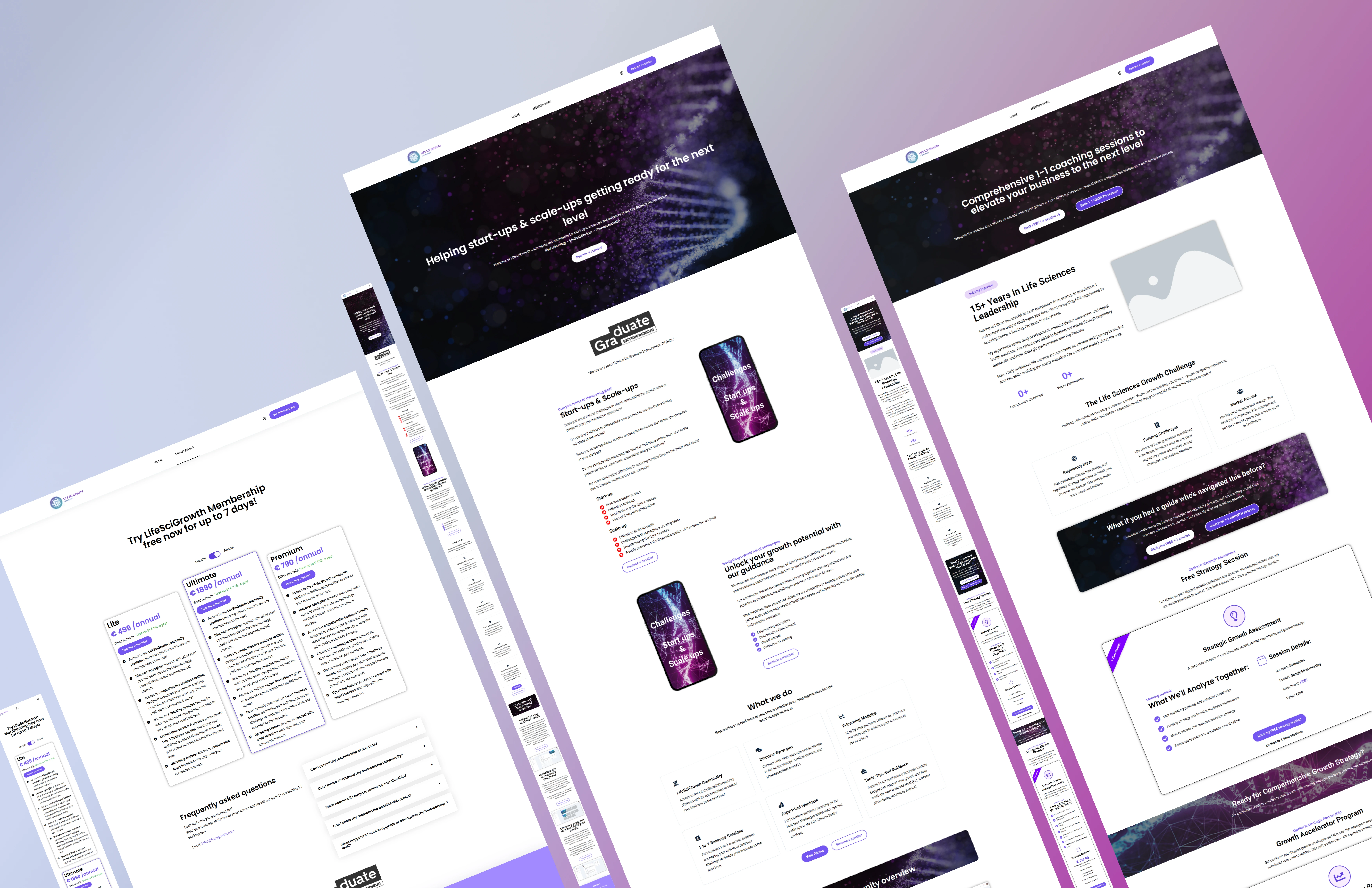
Rebrand with a new Shopify store for supplements: brand, UX, and performance in one release.