This post is a website redesign case study built around real work we did for RobustRise, a dog supply brand that sells online. If you are evaluating whether a redesign can increase conversions, the short version is: yes, when the project fixes clarity, trust, and friction, not just visuals. Below is how that showed up in practice, with outcomes you can compare to your own shop or lead site. The full project write up lives on our RobustRise case page.
I will keep the story grounded in decisions a founder or marketing lead would recognize: unclear positioning, weak product storytelling, and a store that technically works yet still feels hard to buy from. Those issues show up far beyond pet products. If your traffic is decent but revenue lags, the problem is often the same kind of gap. For more on that pattern, see why most websites do not convert.
Why a website redesign can increase conversions
A redesign lifts conversions when it makes the next step obvious and safe. People need to know what you sell, who it is for, and why they should trust you before they enter card details. Speed, mobile layout, and checkout flow matter, but they sit on top of message and structure. If those are fuzzy, shaving a hundred milliseconds off load time will not save the sale.
In our web design and development work we treat brand, UX, and implementation as one thread. That matters for conversion because visitors feel the disconnect when your ads say one thing, your homepage says another, and your product pages bury the proof. A rebuild is a chance to line those layers up. That is the lens for the RobustRise project.
RobustRise before the redesign
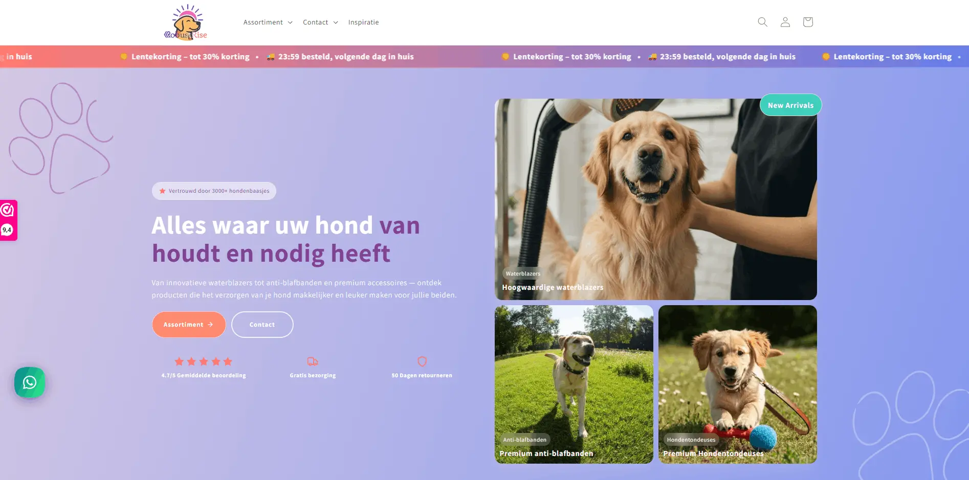
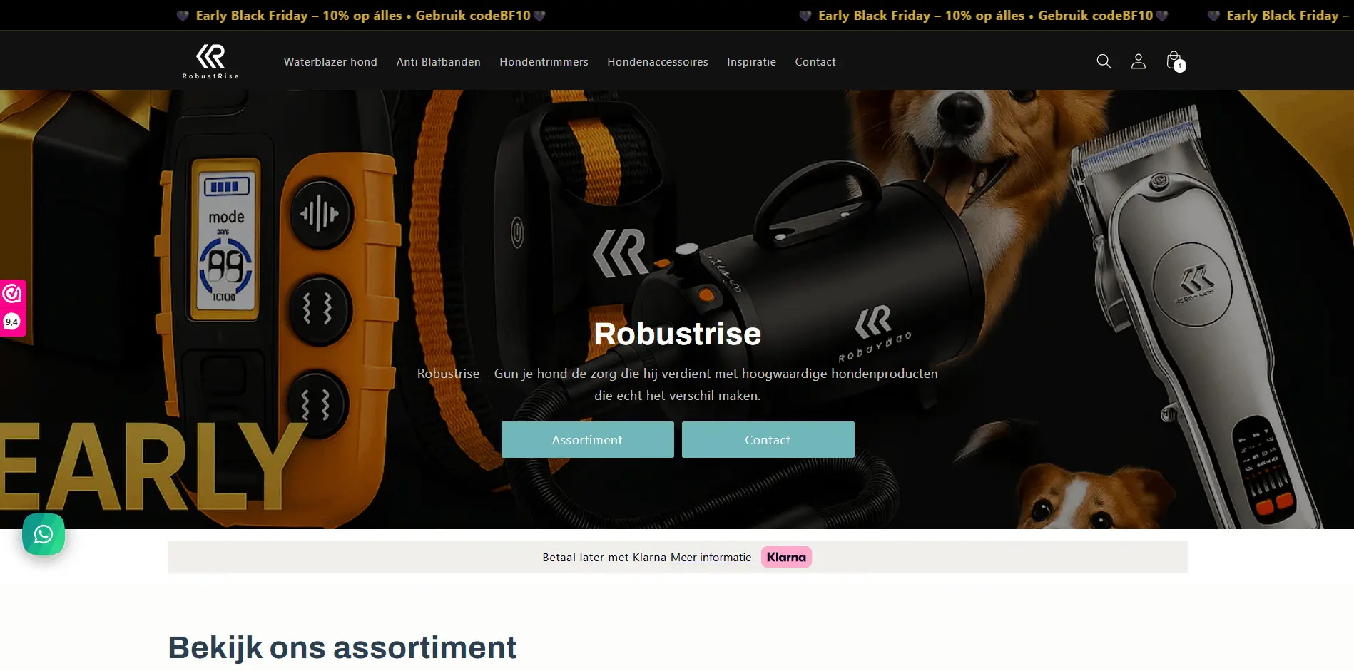
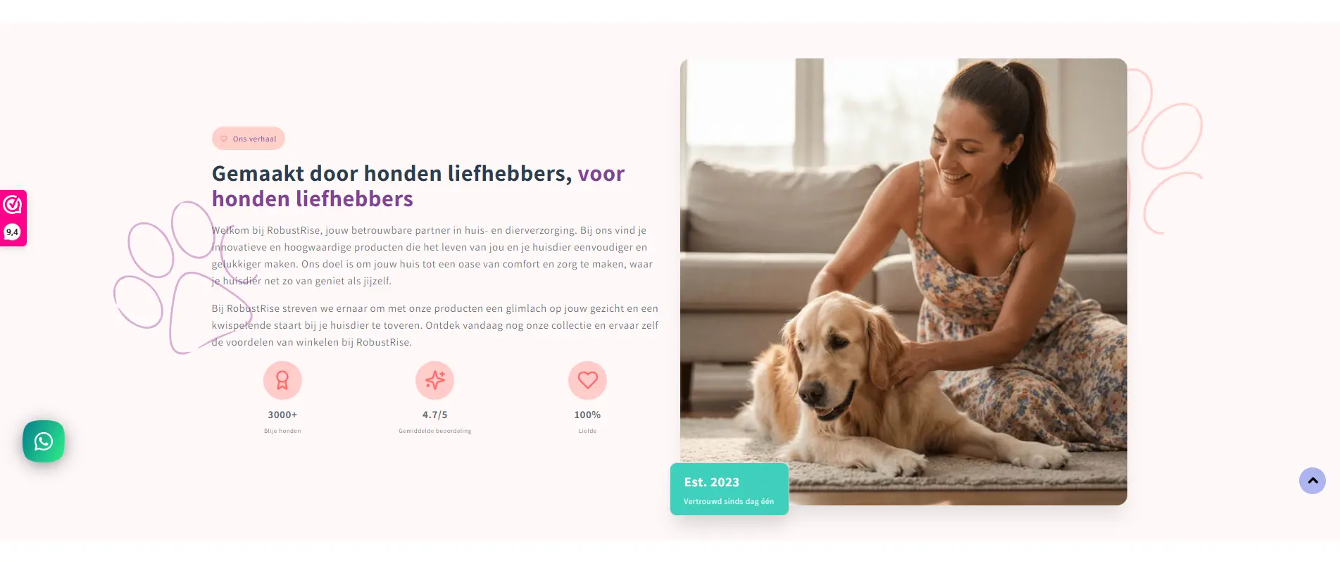
RobustRise already had a business worth investing in: real products for dog owners, repeat purchase potential, and room to grow the brand. Their old site did not carry that story. The brand identity did not read as one coherent system. Product stories were easy to miss. The path from discovery to cart felt heavier than it needed to be, especially on mobile.
That combination usually leads to soft numbers: visitors browse, a smaller slice adds to cart, and an even smaller slice finishes checkout. Marketing spend then feels expensive because the site leaks at every step. A website redesign focused on conversions targets those leaks directly, starting with positioning and layout before you touch fresh code.
What we rebuilt and why
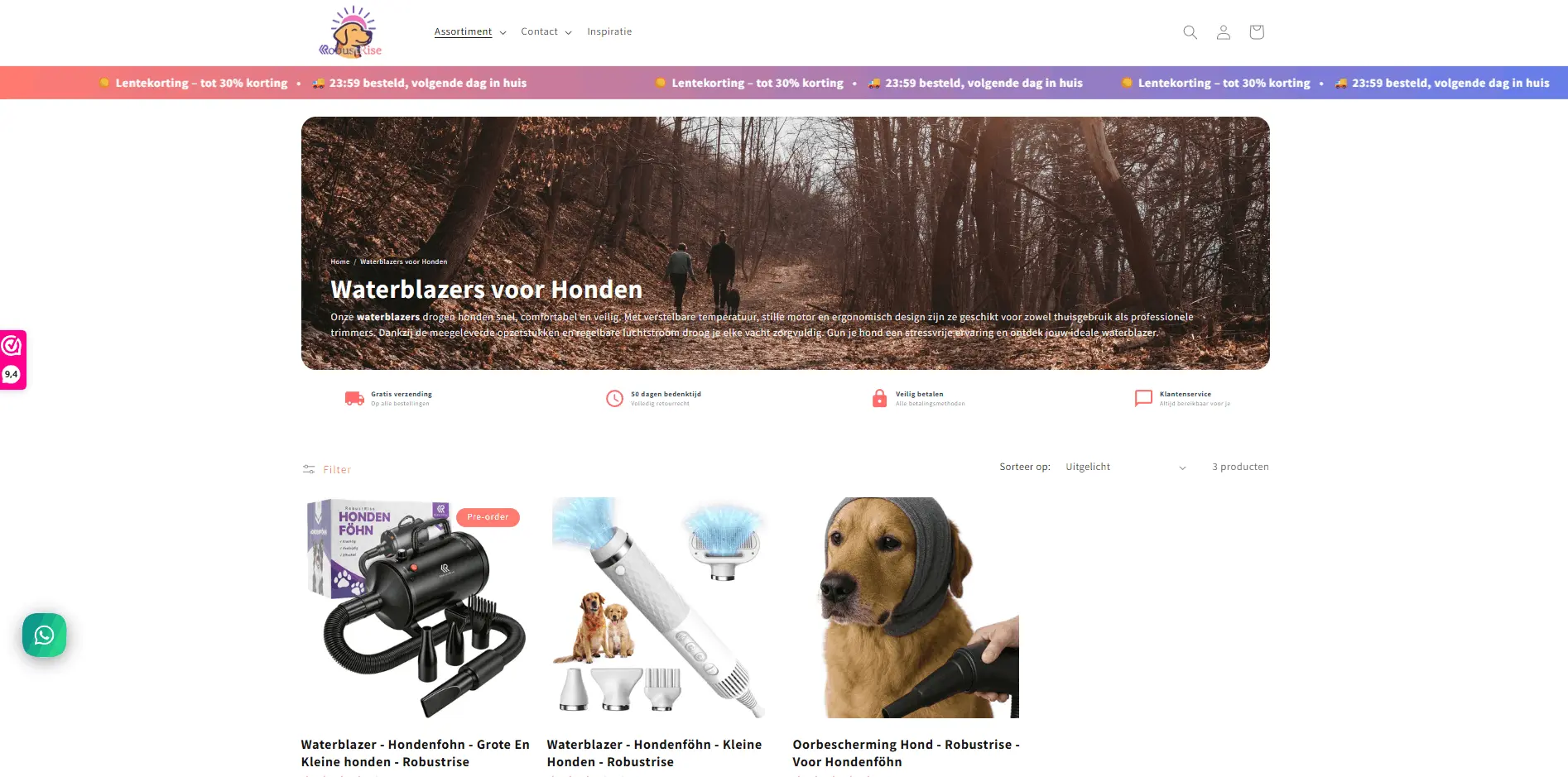
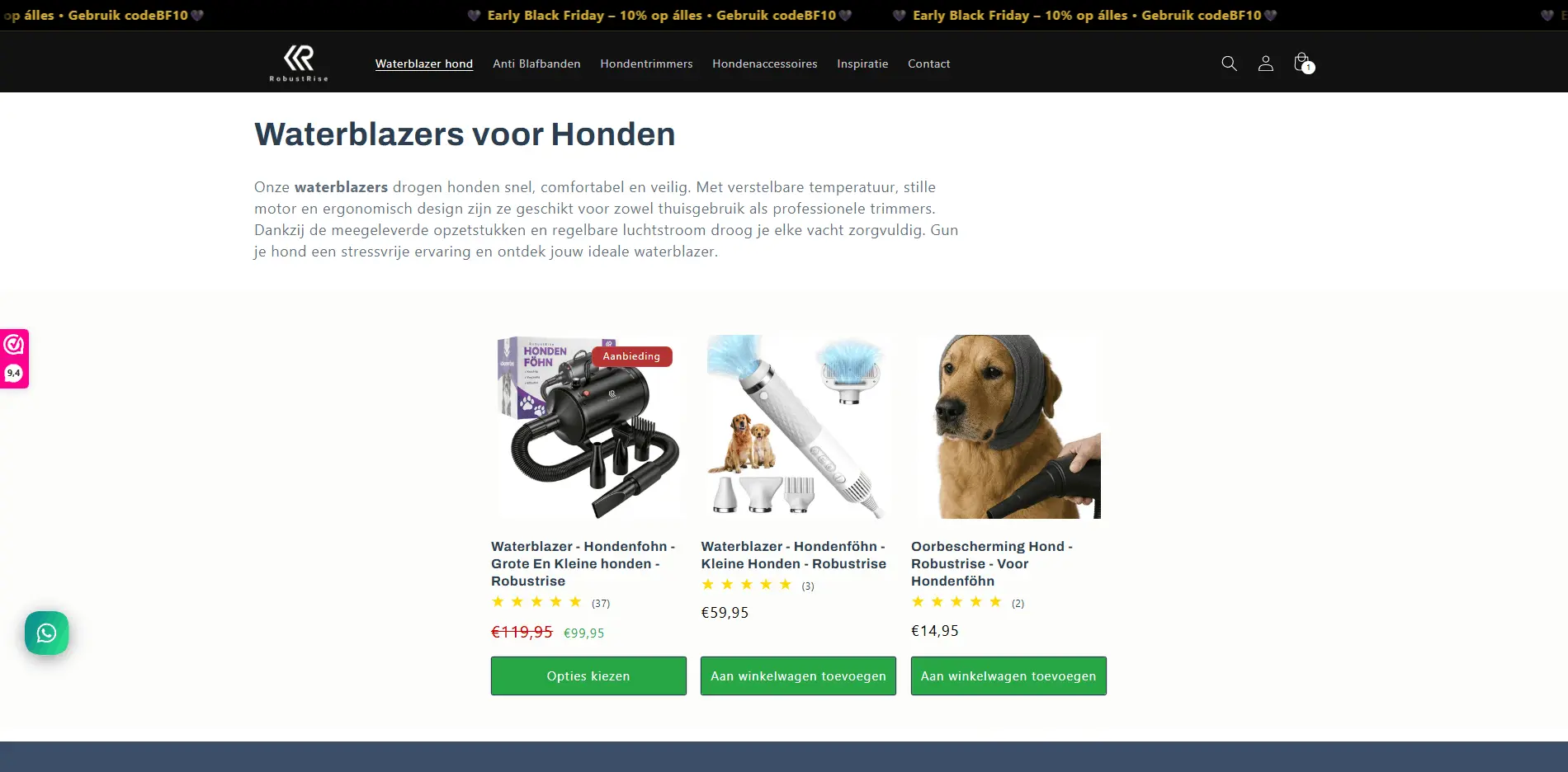
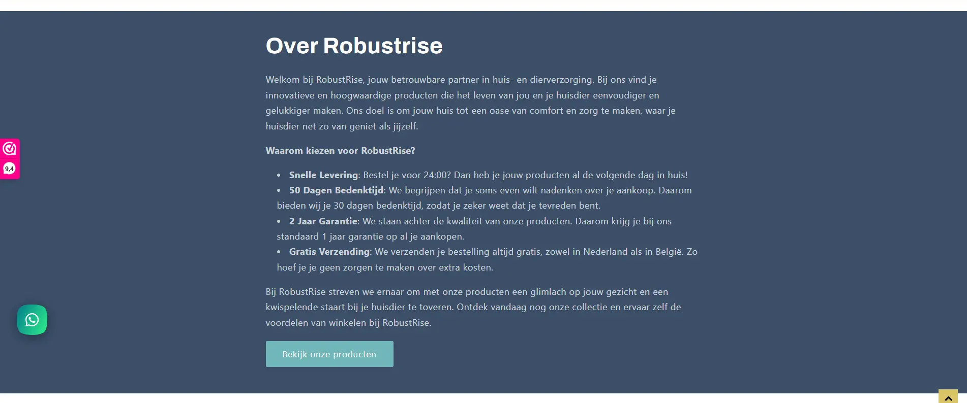
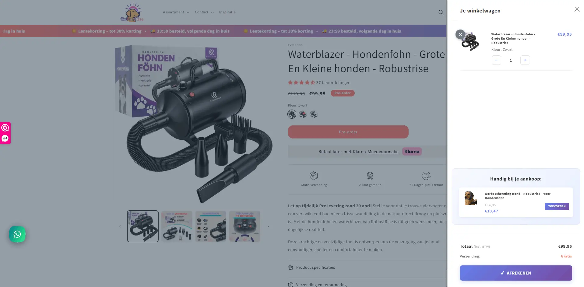
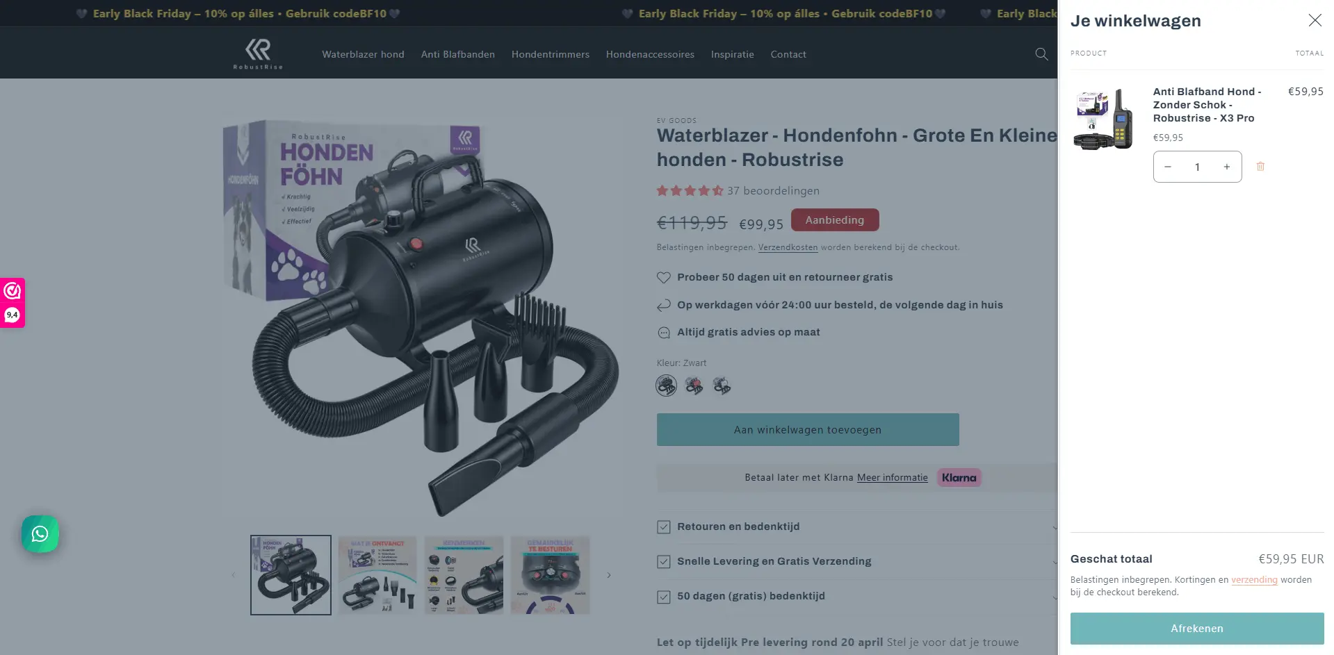
We rebuilt the store on Shopify with a full visual refresh. That meant a defined palette, typography, and imagery that match the quality of the products. Product pages were structured so benefits, use cases, and trust signals come early. Category and collection paths were simplified so shoppers do not have to guess where they are in the catalog.
We also paid attention to the cart and checkout experience so the handoff from browsing to paying feels continuous. Custom cart work was part of making that path feel intentional rather than default. Technical performance was part of the same brief: slow pages cost revenue, especially on phones. The goal was a site that feels fast, clear, and serious about the brand promise.
Before and after: key screens
These pairs are from the live RobustRise Shopify rebuild. Drag the round handle or click anywhere on the image to move the split. With the handle focused, use the left and right arrow keys (hold Shift for larger steps) to reveal more of the before or after state.
Checklist before you sign off on a redesign
Before you freeze the design, check that everyone on the team can say the same three things in plain language.
- The one takeaway you want a new visitor to remember after a quick look.
- The primary action on each key template.
- The proof you show above the fold on product pages.
Planning a redesign for your shop
If you want a second opinion on scope, platform, or what to fix first for conversion, book a short call. We can map a realistic sequence from message to launch.
Outcomes after the website redesign
After launch we tracked the same kinds of metrics we recommend to any e-commerce client. For RobustRise the direction was strong: roughly 120 percent higher user engagement, about a 45 percent lift in conversion rates, a 45 percent reduction in bounce rate, and around 90 percent faster page load performance compared with the earlier baseline. Your exact numbers will depend on seasonality, traffic mix, and what you changed in marketing at the same time, but the pattern is what we aim for: more people stay, more people buy, pages feel lighter.
I share these figures as reported outcomes for this engagement, not as a promise for every project. What is transferable is the approach: treat UX, brand, and tech as one system, measure before and after with the same tools, and iterate on product copy and merchandising once the new foundation is live.
What you can apply to your own site
You do not need a pet brand to use this case. The moves that helped here apply broadly: tighten the story on the homepage, make product detail pages answer objections early, keep navigation shallow, and respect performance on mobile. If you are on Shopify, WooCommerce, or another stack, the technical layer differs. The conversion logic does not.
If you are still deciding whether to commit budget, pair this post with what custom website work tends to cost in 2026 and when it is time to redesign your website. When you are ready to talk scope, use the contact section or open the Calendly link from this page.
Frequently asked questions
Can a website redesign really increase conversions?
Yes, when the redesign fixes real problems such as weak messaging, confusing navigation, slow pages, or a checkout that feels risky. A rebuild is not a magic button. It works when strategy, brand, UX, and technology line up so visitors understand the offer and complete purchases with less friction.
What changed the most in the RobustRise project?
The biggest shift was treating brand, product presentation, and the purchase path as one system. We rebuilt the Shopify store from the ground up with a clear visual identity, stronger product storytelling, and a structure that makes it easier to explore products, read benefits, and check out with confidence.
How should a business measure success after a redesign?
Track conversion rate, revenue per session, add to cart rate, bounce rate on key landing pages, and page speed. Compare the same season or traffic mix before and after where possible, and watch support questions about basic product or shipping details. If those drop while sales rise, the redesign is doing its job.
Is Shopify a good fit for conversion focused e-commerce?
For many product brands, Shopify is a strong base because checkout is trusted, the platform is maintained, and you can customize the theme and cart flow when you need more control. The tool still needs clear positioning, good photography, and intentional UX. The platform supports conversions. The brand and build still have to earn them.
When is a full redesign smarter than small tweaks?
Consider a full redesign when the brand, catalog, or audience has outgrown the current site, when technical debt slows every change, or when metrics stay flat after several modest tests. If you want a structured decision framework, read our post on when it is time to redesign a website and match the scope of work to the size of the gap.
Want this kind of clarity on your own site?
Tell us about your catalog, your current platform, and where revenue stalls. We can outline a redesign plan that lines up brand, UX, and build quality with the conversion goals you care about.