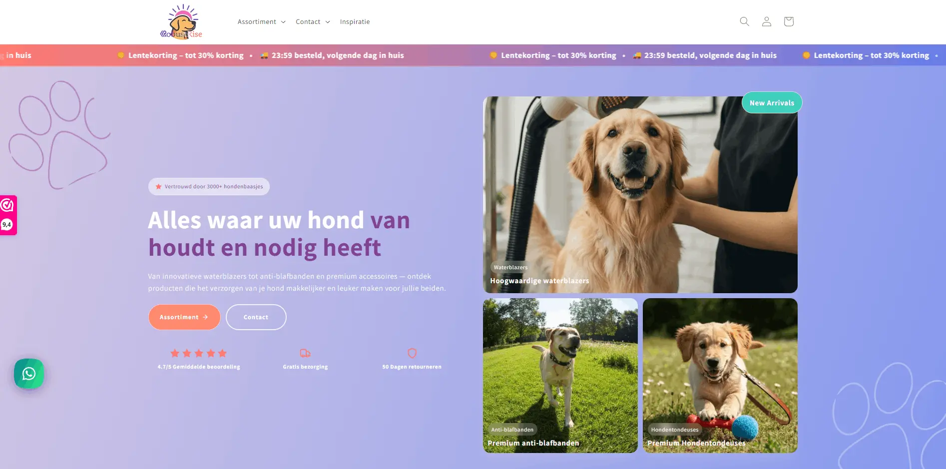
This Shopify redesign case study covers RobustRise, a dog supply brand that needed more than a theme refresh. The products were solid. The storefront did not match that quality, so traffic underperformed.
We rebuilt brand and Shopify templates as one project. After launch, conversion rose about 45%, engagement rose about 120%, bounce rate fell about 45%, and page load speed improved by roughly 90%.
If you want before/after screens and a broader redesign ROI story, read the website redesign conversions case study. For timing and scope on your own rebuild, use the Shopify store redesign guide. Our web development team builds conversion-focused Shopify stores. Full project detail is on the RobustRise case page.
The challenge
RobustRise sold to dog owners who care about quality. The old site did not show that care. Brand elements felt inconsistent. Product benefits were easy to miss. Collections and the path to cart felt heavier than they needed to be, especially on phones.
That pattern shows up in the numbers. People browse, fewer add to cart, fewer finish checkout. Ads then feel expensive because the store leaks at every step. A Shopify redesign only pays off when it targets those leaks, not when it swaps colors on the same weak structure.
When redesign beats more apps
If every CRO test fights unclear messaging, slow templates, or a cart that feels bolted on, stop stacking apps. Fix brand, structure, and performance first.
What we rebuilt on Shopify
Scope was a ground-up Shopify rebuild, not a light theme polish:
- Brand identity: color, type, and visual system matched to product quality
- Homepage and navigation that explain the brand in seconds
- Collection templates that make discovery easier
- Product templates that lead with benefits, proof, and a clear buy action
- Cart continuity so the handoff from browse to pay feels intentional
- Performance work so mobile pages load and respond quickly
Shopify was the right platform because ecommerce is the core product. The conversion lift still came from design and structure, not from the platform logo alone. See also theme vs custom build and the product page layout guide.
Brand and product experience
We treated brand and merchandising as the same job. Visitors should feel product quality before they read a review. That meant a cleaner visual language across homepage, collections, and product pages, not a logo dropped on a generic theme.
On product pages, benefits and use cases come early. Trust signals sit near the decision. Layout supports scanning on a phone. If shoppers cannot see why an item is worth buying in a few seconds, checkout work later will underdeliver.
Planning a Shopify redesign for conversion?
We scope brand, product templates, and purchase-path work against your metrics so you know what belongs in the rebuild.
Cart path and speed
Conversion also fails between add to cart and payment. We tightened the cart experience so it feels continuous with the rest of the store. On mobile, that continuity matters more than desktop polish.
Speed was part of the same brief. Slow product and collection pages tax patience and trust. Performance work sat next to UX, not as a separate phase after launch. Pair this with our Shopify speed guide and cart and checkout UX guide.
Results after launch
After the Shopify rebuild went live, RobustRise saw:
- 45% boost in conversion rates
- 120% increase in user engagement
- 45% reduction in bounce rate
- About 90% improvement in page load speed
Those numbers matter together. Faster pages help, but they do not explain higher conversions alone. Clearer brand, easier product discovery, and a cleaner purchase path did the heavier lift.
Takeaways for Shopify stores
If you run a Shopify store and wonder whether a redesign is worth it:
- Align brand and storefront. Ads, homepage, and product pages should feel like one system.
- Fix discovery before discounts. Weak collection and product templates waste traffic.
- Design the cart handoff. Default cart UX is rarely enough for a premium brand.
- Treat speed as conversion work. Especially on mobile product paths.
- Measure the funnel. Conversion, engagement, bounce, and load time beat vanity polish.
For project timing and scope, start with the Shopify store redesign guide. For visuals and redesign ROI framing, see the conversions case study and the RobustRise project page.
FAQ about this Shopify redesign case study
What results did this Shopify redesign deliver
After the rebuild, conversion rates rose about 45%, user engagement rose about 120%, bounce rate fell about 45%, and page load speed improved by roughly 90%.
Was this a theme swap or a full Shopify rebuild
A full rebuild. Brand identity, homepage and collection templates, product pages, cart experience, and performance were redesigned together. A theme polish alone would not have fixed the conversion leaks.
What should other Shopify stores take from this case study
Rebuild brand, product storytelling, and the purchase path as one system. Fix homepage clarity, collection discovery, product page proof, mobile speed, and cart continuity before adding more apps.
When should a Shopify store redesign instead of running small tests
When brand, structure, and technical debt block growth, and modest CRO tests stop moving revenue. If every improvement fights the theme and messaging, a scoped rebuild usually wins.
Where can I see the full RobustRise project
The project page has delivery detail and visuals. For before and after screens plus redesign ROI framing, see the website redesign conversions case study.
Ready to redesign your Shopify store for conversion?
We rebuild Shopify storefronts around brand clarity, product UX, and a purchase path that converts. See RobustRise for proof.